Project Overview
This project challenged our team to create a management tool that would increase transit accuracy, reduce lead time, and enable excess inventory reduction for a global pharmaceuticals company.
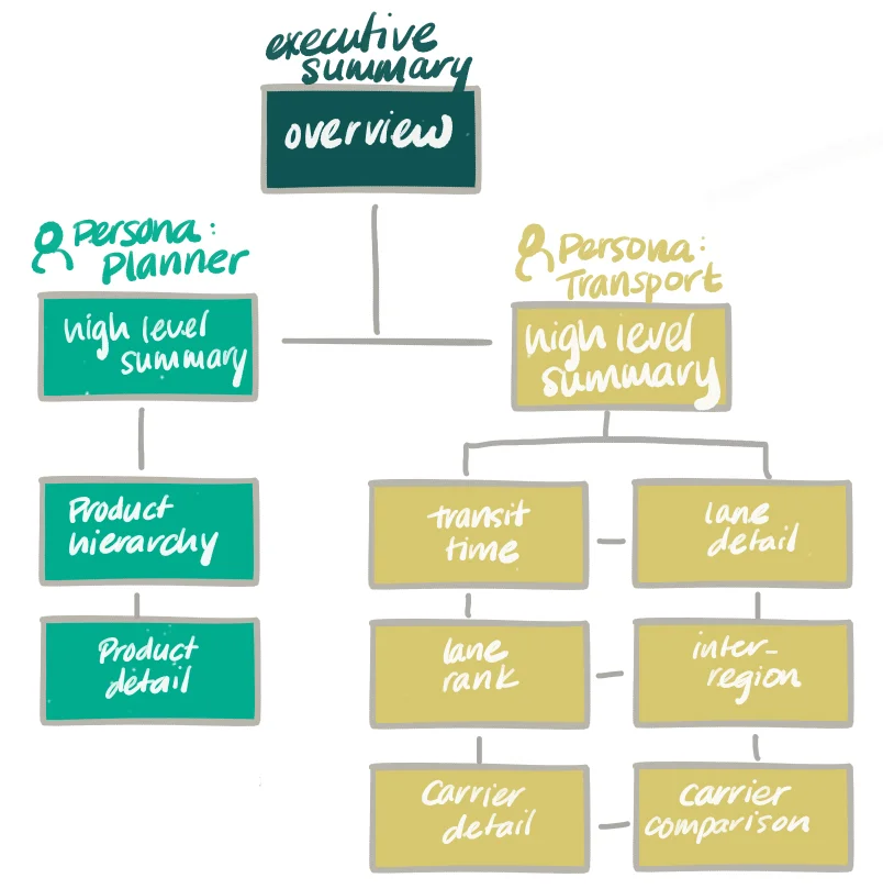
The user flow for the tool allows users to interact with information in one cohesive interface, while providing tailored information for their specific role. The interface enables users to understand overall health of Global Transit as well as drill down to detailed views related to their function. The dashboards are designed for maximum flexibility, automation, and collaboration to increase efficiency and consistency of global transit.
Role
Lead Strategic Facilitator, Lead UX Designer, UI Designer
Click to learn more about my design process for how to bring UX into analytics and data.
Visioning Session
After conducting research on the industry and client, I facilitated a visioning session with our client. We were limited to about 2 hours to discuss two personas and come up with a sketch concept. Because the time limit was a bit of a challenge, I made sure to set expectations with the client that we would need more iterative reviews. They understood and appreciated the foresight and agreed to be responsive and attentive with feedback.
User-flow
From the visioning session we gleaned that we needed to create a user flow that not only allowed two personas to evaluate the information but also allow an executive summary view that sat above both of these. While the data that both personas are looking at comes from the same sources, the types of questions they are asking are different, leading us to different types of views for both. We concluded with the userflow on the right:
Low Fidelity Wireframes
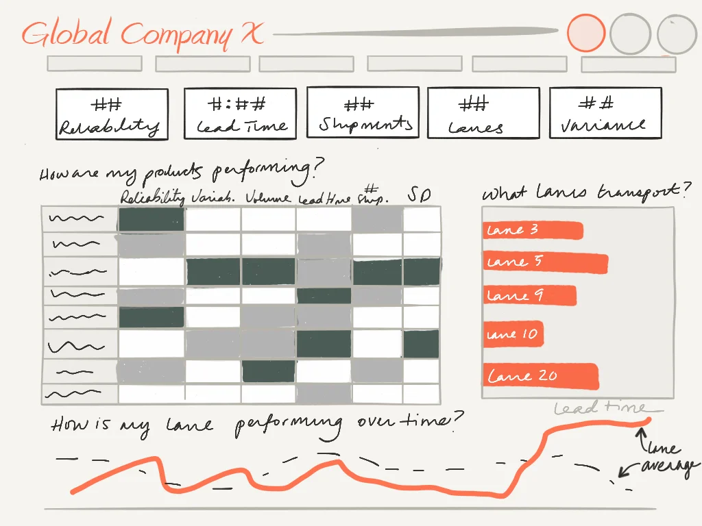
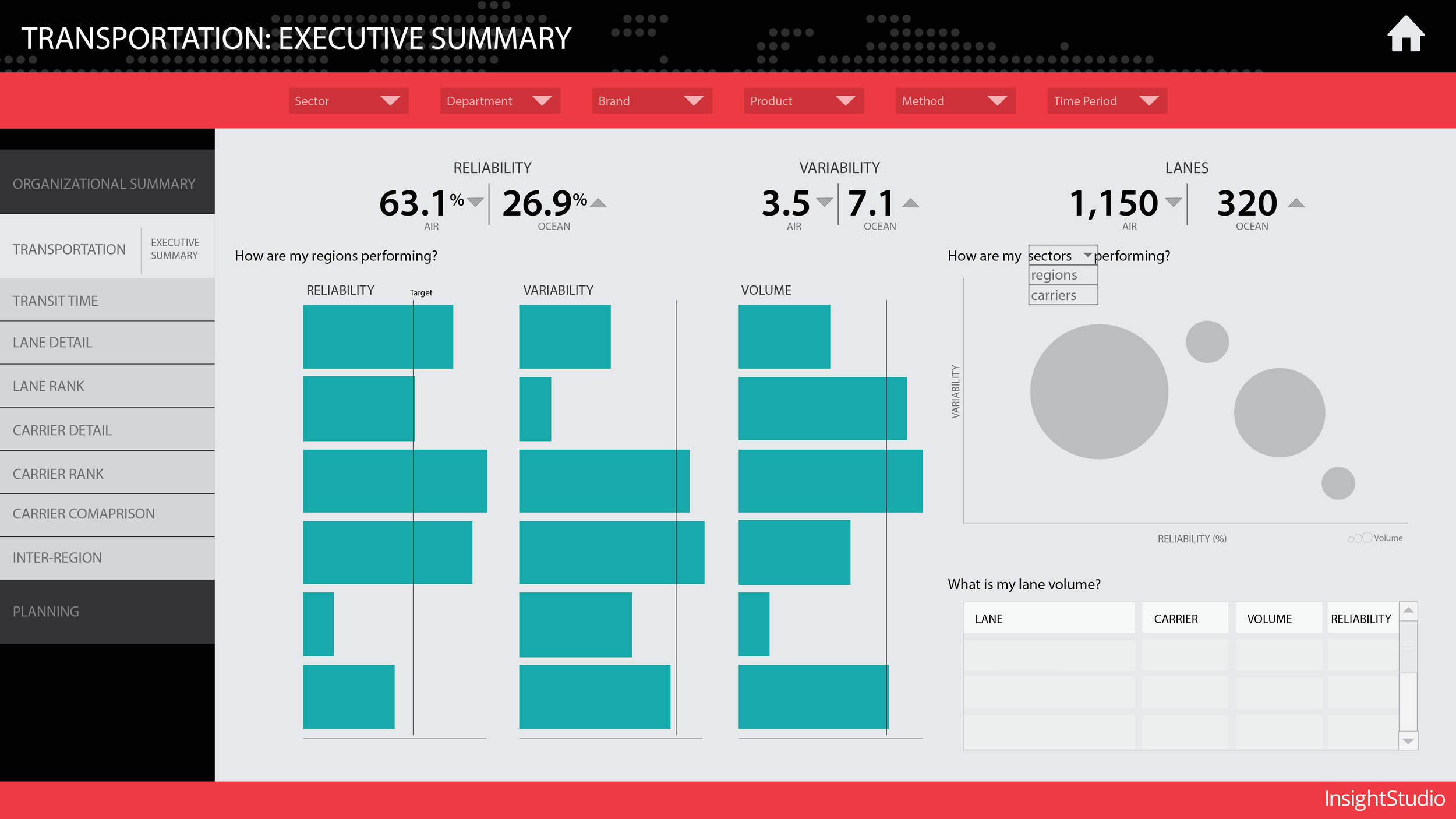
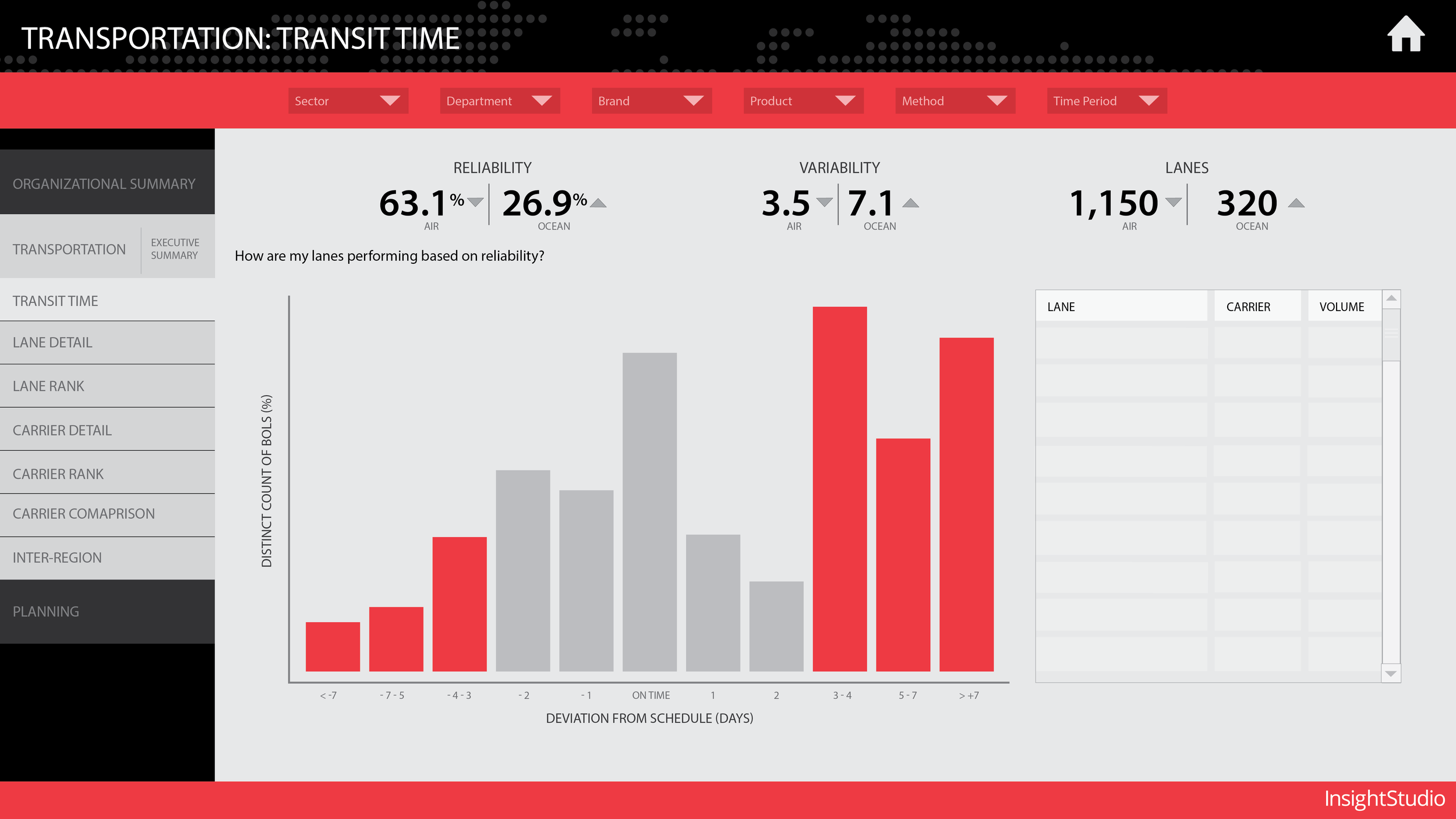
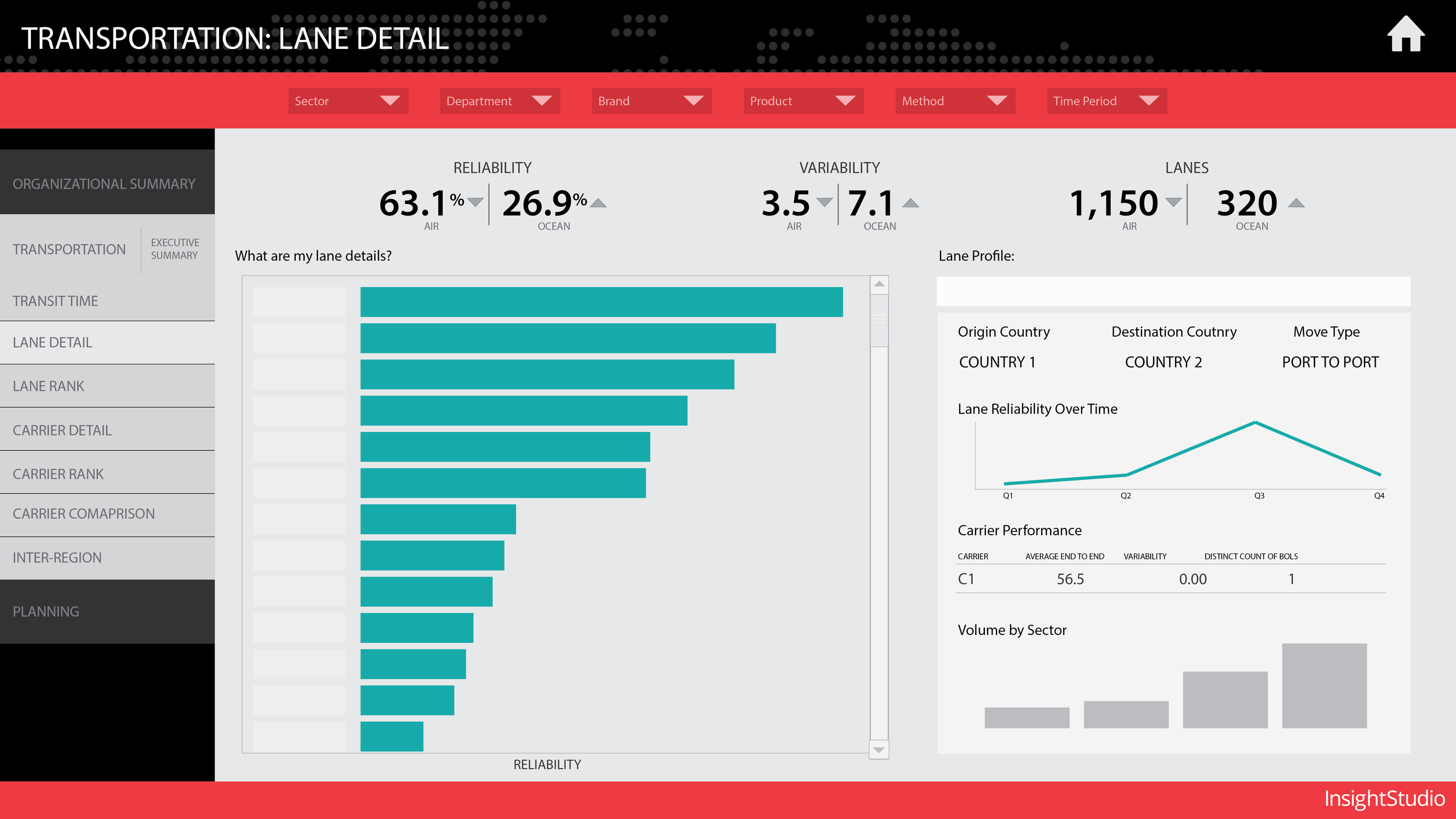
The first iterations of the wireframes we available to the client a few days after our visioning session. I created these sketch wireframes on an iPad and met virtually with our clients every two to three days to evaluate progress and make sure we were on the right track. The first image below is the executive organizational summary followed by two views for the Planner persona. The remaining views are variations for the Transportation persona.
High Fidelity Designs and tool development
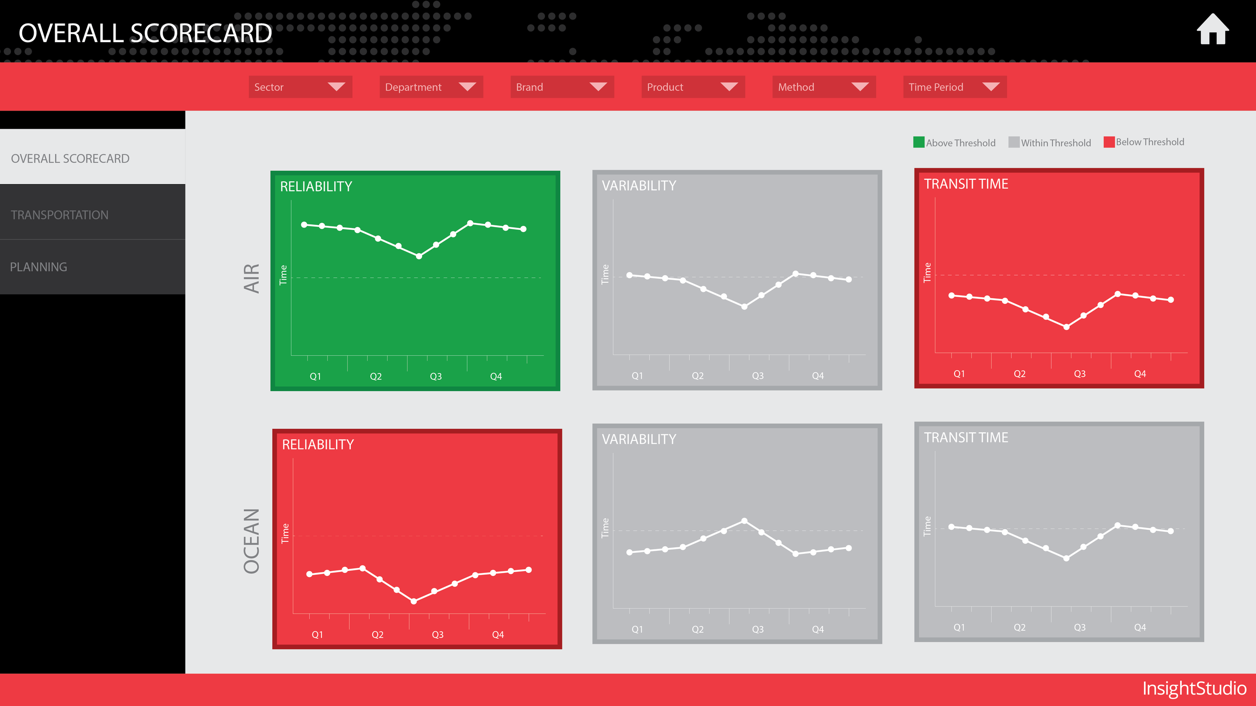
I iterated at the low fidelity phase for a couple weeks until we had sign off on the types of visuals we wanted to include. The tool itself will be built in Tableau and will be most commonly consumed on a desktop. I moved forward with translating these low-fidelity wireframes into high-fidelity wireframes and design assets that eventually lead to the tool development.
